LAB 01: WORKFLOW FOUNDATIONS > TUTORIAL
Premise and Objectives
Our first exercise covers the fundamental workflow that will be the basis for future lab exercises throughout the quarter: (1) loading and manipulating geospatial data in QGIS and (2) exporting your project in a form that will enable you to continue design work in another software environment. After completing this exercise, you will have:
You will then post your work-in-progress to Are.na.
Prep
Download the data repository for this class from the G: drive or using this link and save the downloaded folder to your preferred working location. In this exercise, we will use the following datasets:
Note: Some of the datasets in the repository have already been preprocessed specifically for this exercise. Processing data is also essential to the workflow, and we will cover it in future exercises.
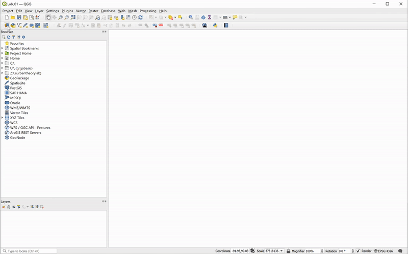
Setting Up QGIS
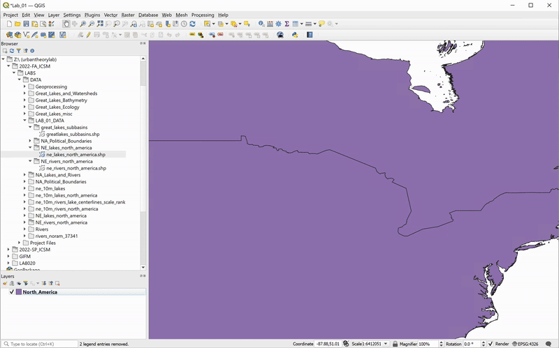
Launch QGIS. Your new blank map project will look something like this:
![]()
Begin to familiarize yourself with the interface. Yours may not look exactly the same as the layout shown above. For instance, most toolbars and panels are movable, allowing you to set up your preferred workspace. You can always add or remove these workspace elements by clicking
Important Note: Like all GIS software, QGIS provides an environment in which we work with spatial data (whether vector- or raster-based). Datasets are not stored within QGIS. Instead, layers stored elsewhere are assembled within a map project where we can visualize, compare, manipulate, and analyze them together. Within the map project, we can also compose and export a map. Storing your data outside of the project allows you to include a particular data layer in several map projects without having to produce multiple copies of it, but it carries two important implications:
Save your (currently empty) map project in your working folder by clicking
Your project was added to the Browser Panel in the Project Home folder.
Adding Data
There are several ways to add data to a project. We will begin by using the
![]()
In this exercise, we will be working with vector data. Vector data is a type of spatial data that represents geographic features as points, lines, or polygons. It is stored as a collection of geometric primitives of the same type, also referred to as feature class.
![Data Source Manager > Vector > Browse > ../North_America.shp > Add]()
A shapefile is a vector data format that stores the shape, location, and attributes of geographic features. Shapefiles are the most widespread format of vector data, due to their long history and wide support by GIS software. But they can also be cumbersome to manage.
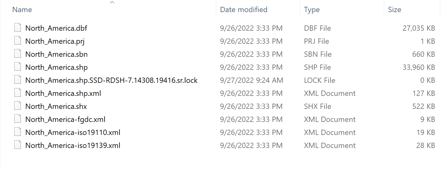
Leave the QGIS window briefly; open File Explorer and navigate to the shapefile you just added to your scene. You will notice several different file extensions here that may be unfamiliar. Shapefiles are actually collections of separate files that contain different information or perform specific roles. The primary component files are as follows:
![There are several different components of a shapefile. Keep them always together in the same folder.]()
For more information on these extensions and others, see this explanation by ESRI.
Important Note: The collection of files constituting a shapefile must stay together in the same folder; otherwise, QGIS will not be able to load the layer or may not read it correctly.
Return to your QGIS project, and add the
Rivers are represented by lines, and countries, lakes, and basins layers are represented by polygons. The order of the layers can be controlled with the Layers panel (click and drag to reorder). You can toggle layers on and off by clicking the check-mark next to their name, allowing you to choose which are visible when multiple layers are added to a project. Save your map project.
![You can use the Browser panel to add data layers. Use the Layers panel to change the order of appearance or control visibility.]()
Note that the colors are the same for all features in a layer, and the assigned color is arbitrary.
Attribute Table and Interactive Selection
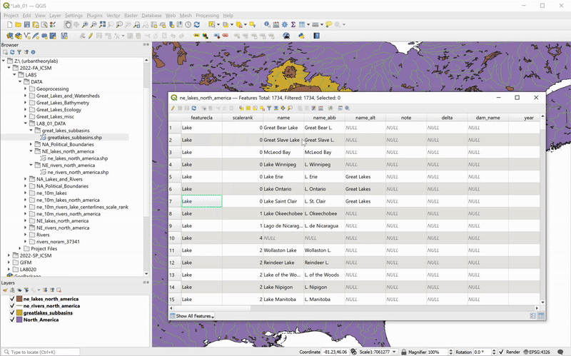
Each line, point, or polygon in a feature class corresponds to an entry point in a data table — an Attribute Table. Attribute Table contains information about the features in the shapefile. Attributes can be descriptive, such as the name of a river or lake. They can also be quantitative, such as the length of a river or the surface area of a lake. To access the Attribute Table of a layer (and thus inspect the attributes of each feature), right-click on the layer name in the Layers panel and choose
![The Natural Earth's river shapefile contains river names (in several languages), scale rank, and line width attributes for creating tapered drainages.]()
To quickly identify which polygon corresponds to a given feature within the Attribute Table, you can interactively select a feature by clicking on the row number. This will highlight the feature in the attribute table and the data frame.
![To dock the Attribute Table to the main window while interactively selecting features, click the “Dock Attribute Table” button on the table’s menu bar. To zoom into the selected feature, right-click on the feature in the Table and select “Zoom to Feature.”]()
Of course, the relationship between the geometry and attributes of a feature also works in the opposite direction. Using the Selection Tool from the Selection Toolbar (chosen in the GIF below), you can interactively select polygons and highlight them in the Attribute Table (make sure the layer you want to select features from is highlighted in the Layers Panel). Further, you can isolate selected features in the table: choose
![]()
Click the
![]()
On your own: interactively select and inspect features and attributes of the all added layers.
(A Very Short) Intro to Projections and Coordinate Reference Systems
Map projections are mathematical transformations used to represent a three-dimensional shape of the Earth on a flat surface. Every time we display a geospatial dataset on a computer screen, a map projection is involved. They are powerful, complex, fun, but can also be frustrating to work with.
We will cover projections and coordinate reference systems (CRSs) in future exercises, but for now, just be aware that QGIS automatically sets your project’s CRS to the one specified by the first shapefile you bring into your project (that’s what the .prj file of your shapefile ir for). To find out what CSR you’re in, check the Status Bar (bottom right corner of your window):
![]()
There will be a letter and number code, here EPSG:4326. Double-click on it, and the CRS dialogue will pop up; you’ll see any recently used CRSs, a library of predefined CRS options that come with QGIS (over 7,000!), and the specific information about what CRS is in current use:
![]()
There are many projections for many uses; some are created by governmental agencies for use at a very specific scale (for example, each state has its own CRS that is optimized to minimize distortions for that scale), while others are meant for global use. The one we’re using, WGS84, is the standard CRS for global use, and is specified by the majority of global datasets.
The next step is to change the CRS. While there are quite a few complicated steps going on behind the QGIS curtain, from the user’s point of view it’s a fairly straightforward process. In this example, let’s choose USA Contiguous Albers Equal Area Conic (ESRI: 102003) which, as the name suggests, is centered to the contiguous USA, and is developed to preserve surface area properties of the features in this region:
![You can find the Albers projection by searching in the Filter field, and by scrolling to find it.]()
Intro to Symbology
Now that we’ve set up the desired CRS, it’s time to change the appearance of our layers. To start, we will change the background color from white to blue.
Click through
![]()
Next, we will set the symbology of the countries layer to appear like a borderless blue continent:
![]()
Repeat the process for the subbasins (setting the Fill color to an even lighter blue) and lakes (setting the Fill color to white). Finally, set the river colors to white. For the rivers, represented by lines, set the Simple Line color to white. Click OK .
![]()
What if we want to add hierarchy in the way we represent rivers and have the widths of the river centerlines to correspond (in relative terms) to the sizes of their drainage basins? Luckily we have a field in the shapefile’s Attribute Table – strokeweig – precisely for that purpose. Open the Attribute Table of the rivers layer again and notice that the strokeweig values range from 0.2 to 2. Next, open the layer’s symbology tab again (by double-clicking on the layer name in the Layers Panel) and follow these steps:
![]()
Voilà! Save your map project.
On your own: What happens if we change the Value from
QGIS Print Layout end Exporting
You’ve just completed the first (and most extensive) part of this workflow sequence. The following part covers the basics of creating a print layout in QGIS and some considerations for cartographic design in general. The covered technical material allows you to move your QGIS projects from map space to paper space and export your work either in a print format or in a form that will enable you to continue design work in another software environment.
So far, you have worked within QGIS’s Map View, adding and symbolizing geospatial datasets. This environment lets you view your data from whatever spatial scale you set through the zoom and pan settings in the map canvas view. We can refer to this environment as data space. To export your work from QGIS to be viewed as a static image outside of the program, you must fix the spatial scale and extent of your map. This can be understood as paper space. The
The transition from data space to paper space also opens up the opportunity to think about aspects of cartographic design that are not relevant when performing analysis in QGIS, but are relevant for informing and orienting your audience to the geographic context of your map.
How will you convey the meaning(s) of the chosen symbols?
Maps typically have:
You can add those map features in the When you are satisfied with your symbology choices and are ready to export a map document from QGIS, you will need to create a new Print Layout.
![]()
Select the
![The Print Layout window will open once you have specified the layout title.]()
To set up page dimensions and add a map item, follow these steps:
![There are preset paper sizes, and you may also specify your size using the "Custom" option and choose specific dimensions and units.]()
On the left toolbox, click
![]()
![]()
At this point you may want to go back to the data view to adjust your layers’ symbology settings to better fit this particular layout size and scale (for example, I changed my rivers centerlines widths by setting the new size range from 0.1 to 1).
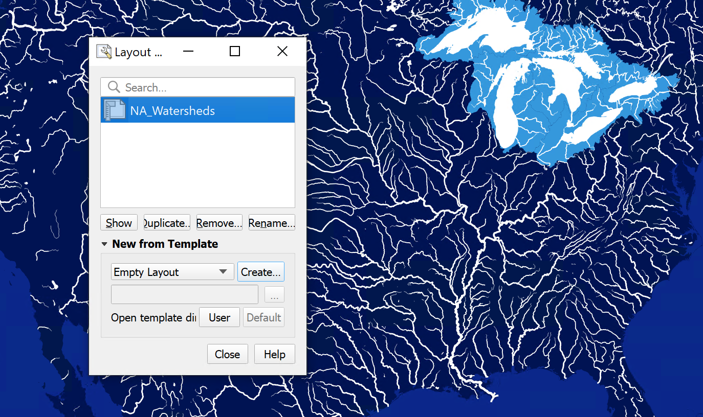
If you close the Layout window, or want to work on a different layout, you can do so by clicking on the Layout manager in the main toolbar and the list of your project’s saved layouts will pop up:
![]()
We will explore more Layout tool functionalities in the coming weeks, but for now, let’s wrap up this section by exporting our map. Save your project.
You can export your layout as an Image, SVG, or PDF by either clicking through
![]()
Notes on Workflow
It’s possible to use the Print Layout tool within QGIS to design complete and visually compelling maps. However, it is generally much faster to use the Print Layout as a part of the larger workflow to:
Exporting maps with vector-based data in SVG format allows you to manipulate your data layers' style, symbology, or overall composition in Adobe Illustrator or another vector graphics software.
Choose
![]()
Export the SVG file in your working directory and save your project. Close QGIS.
Important: Continue using best practices for file organization, management, and naming conventions; consider exporting all QGIS files into a subfolder, e.g
Opening Illustrator
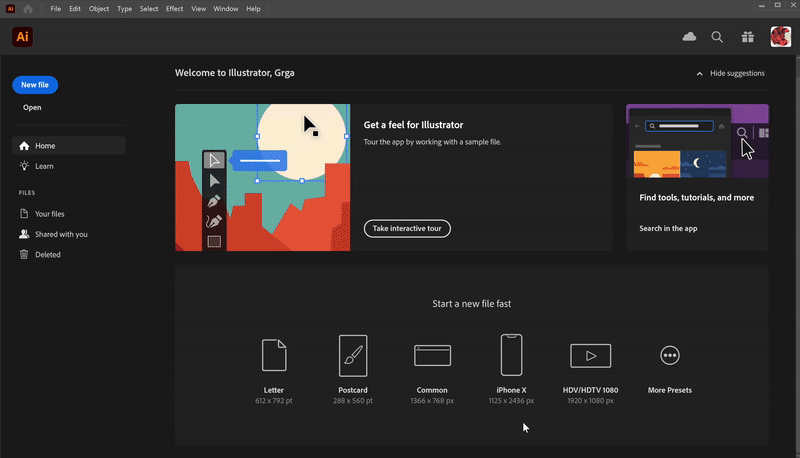
Launch Illustrator. You will be prompted to choose a template for your project: several options exist for different kinds of print and digital work (similar to QGIS layout presets). We can customize options here, including the standard size, orientation (portrait or landscape), and the number of “artboards” — you can think of an artboard as an analog to a canvas or drawing surface. You can also give the file a name in the “More Presets” dialogue. Once you click Create, AI will create your new project document. You may also skip the “More Presets” step and create a document directly from the previous dialogue.
![Set the width/height of your document (e.g. 1080 x 1080)]()
Begin to familiarize yourself with the interface. It should look something like this:
![]()
Depending on which “workspace” you’ve selected (
![]()
Adding Artwork
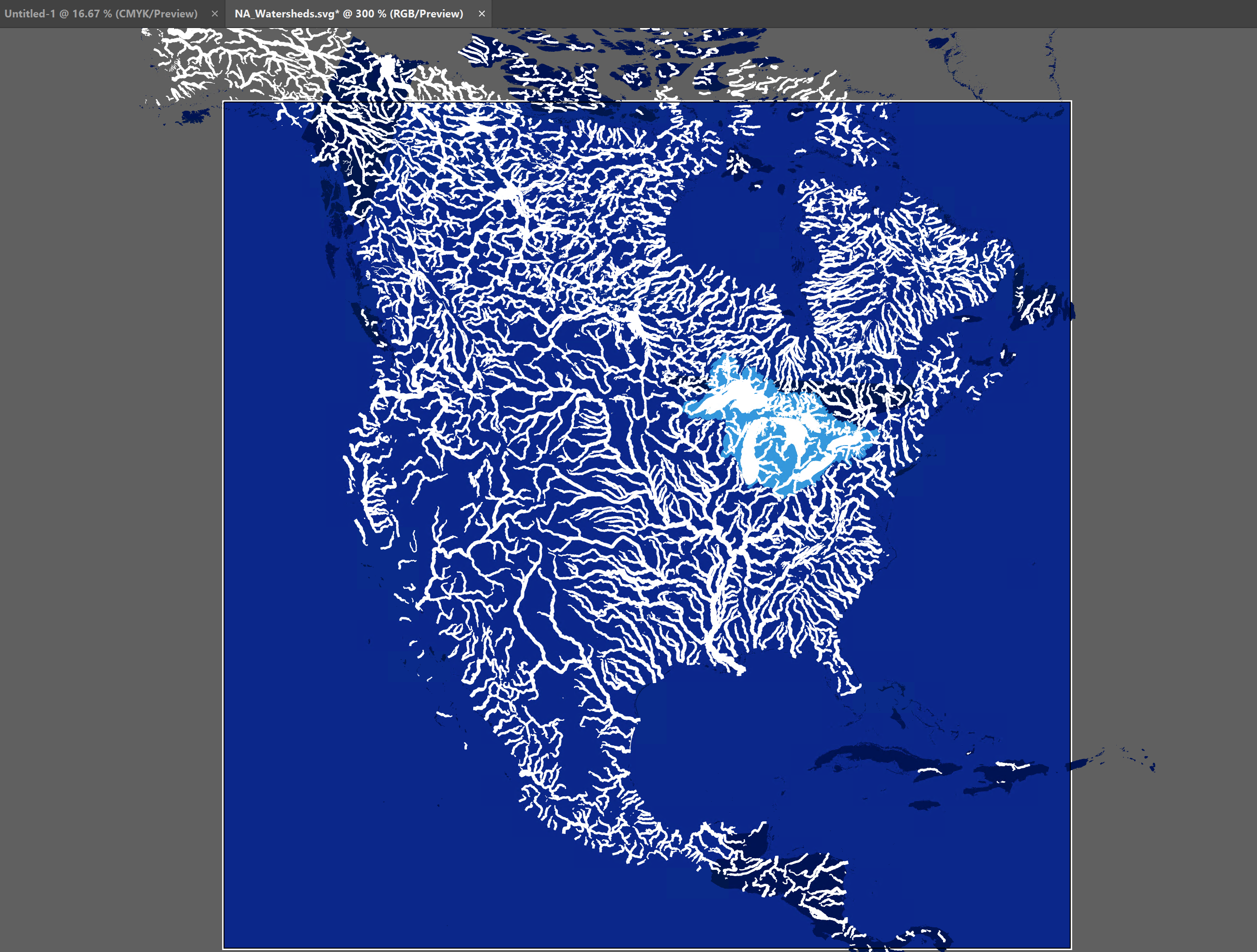
Next, open your SVG file by dragging it from Finder/File Explorer to your workspace. Note that this will open a new document in a separate tab. You can actually skip the process of creating a new document if you aim to edit an existing Ai-editable file (such as an SVG we just exported from QGIS):
![]()
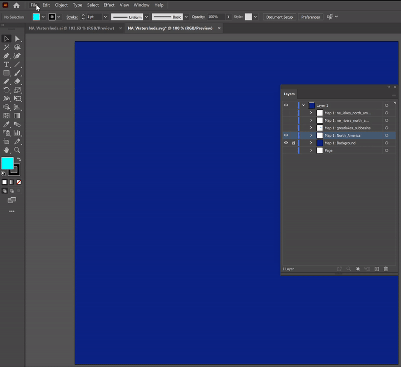
Open your Layers Panel (to the right), and note that the data layers from QGIS (including the background) are all preserved as separate sublayers of the “Layer 1”:
![]()
Just like in QGIS, you can control the order of the layers in the Layers panel (click and drag to reorder), and you can toggle layers on and off by clicking the little eye icon next to their name. You can also “lock” individual layers by clicking the little padlock sign next to their name, which will prevent you from accidentally moving or deleting any layer features.
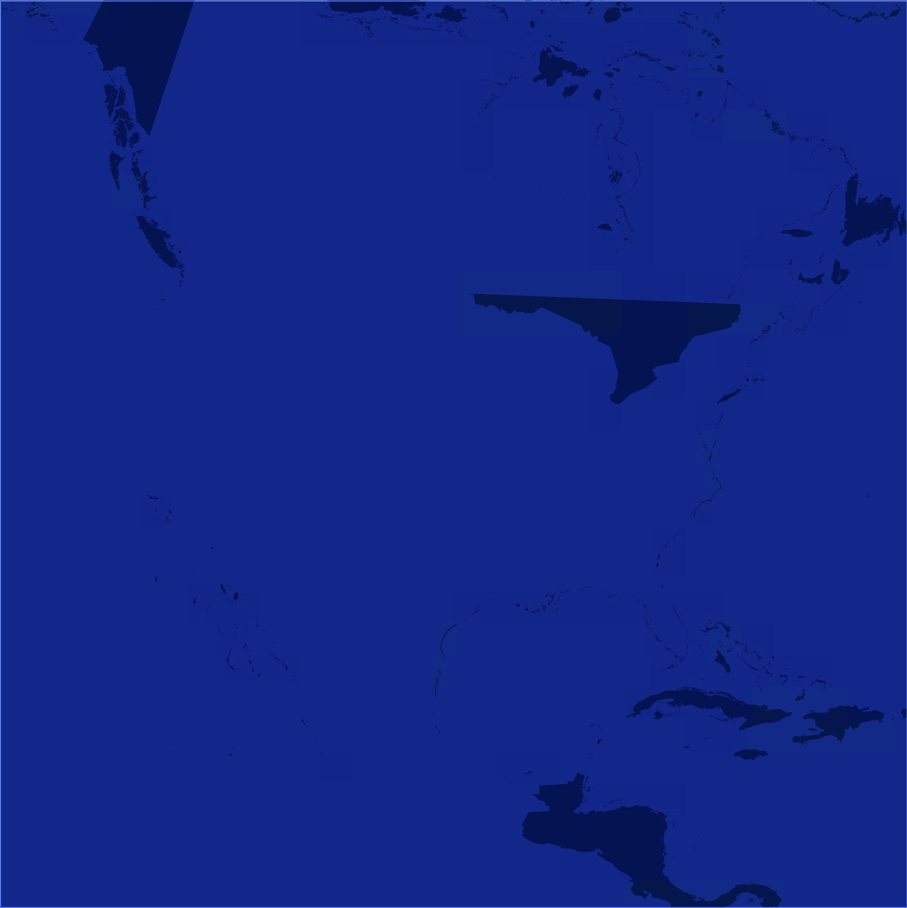
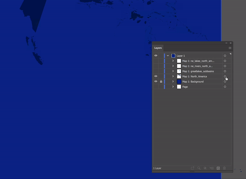
Now, toggle all layers off except the background and the “North_America”:
![]()
If your artboard looks like the image above, you must be thinking: “Oops! This doesn’t look like North America. What now?”
Let’s assume you’ve gone back to QGIS, and re-exported the SVG (and triple-checked the settings were correct), but the problem persists... Unfortunately, this is widespread in these types of workflows: one of our layers got broken down in the process, and we cannot correctly display it in Illustrator. (Your geometry will break down more often if you’re changing coordinate systems in QGIS, which we did).
Luckily, there are many ways we can troubleshoot this issue. We will offer three approaches below, and we are agnostic as to which one you choose to pursue (although we recommend exploring all three on your own!).
Option 1
You’ve realized that you don’t need to include features representing the continent for your map to convey what you want. This is legitimate and often the best solution when the layer in question is there only to provide a background/context to your map (it wouldn’t work for the rivers layer, obviously).
In this case, all you need to do is toggle off or delete the layer, and you can export a finished map (or continue editing other features that are displayed correctly, of course).
Option 2
You’ve figured out a “hack” by separately exporting only the “corrupt” layer from QGIS, but this time as an image (raster file) instead of an SVG (vector file). You will then import this image into your Illustrator file and replace the faulty linework. To do so, follow these steps:
![]()
![You can quickly select (and delete) all objects of a layer by clicking on the little circle next to its name.]()
![]()
Toggle the visibility of the basins, rivers, and lakes, and you should be done!
Option 3 (most elegant)
You’ve decided to look for another (polygon) shapefile representing countries or continents that won’t cause you any trouble during export. You got lucky: Natural Earth has a dataset called Land (Land polygons including major islands), which does precisely that!
In this scenario, all you need to do is download the “Land” dataset and use it in this exercise instead of North America (you may notice that the “Land” is a global dataset, but that shouldn’t be a problem for completing the work; just zoom into North America and ignore the other polygons).
![]()
Exporting Artwork from Illustrator
When you’re done troubleshooting and editing linework, it’s time to export your drawing.
To export a vector file format such as an SVG or PDF (which can be significantly resized without losing any of their quality), navigate to
To export a pixel-based raster file like PNG or JPG, navigate to
If you want to export an image cropped to the exact dimensions of your artboard (as opposed to cropped to your artwork), select
This foundational module lays the groundwork for creating and working with spatial media.
Premise and Objectives
Our first exercise covers the fundamental workflow that will be the basis for future lab exercises throughout the quarter: (1) loading and manipulating geospatial data in QGIS and (2) exporting your project in a form that will enable you to continue design work in another software environment. After completing this exercise, you will have:
- Become familiar with the QGIS user interface
-
Learned the basics of adding, interpreting, and visualizing vector data in QGIS
-
Explored basic symbology techniques
- Learned the basics of creating a print layout in QGIS and exporting a map
- Imported a map to Ai
- Troubleshoot an issue you encountered in the process
You will then post your work-in-progress to Are.na.
Prep
Download the data repository for this class from the G: drive or using this link and save the downloaded folder to your preferred working location. In this exercise, we will use the following datasets:
- Detailed World Polygons, North America (compiled by the US Department of State, Office of the Geographer)
- Rivers and Lake Centerlines (derived from World Data Bank 2)
- Lakes and Reservoirs (derived from World Data Bank 2)
- The Great Lakes subbasins (compiled by USGS Great Lakes Restoration Initiative)
Note: Some of the datasets in the repository have already been preprocessed specifically for this exercise. Processing data is also essential to the workflow, and we will cover it in future exercises.
Setting Up QGIS
Launch QGIS. Your new blank map project will look something like this:
Begin to familiarize yourself with the interface. Yours may not look exactly the same as the layout shown above. For instance, most toolbars and panels are movable, allowing you to set up your preferred workspace. You can always add or remove these workspace elements by clicking
View > Panels or Toolbars (from the main menu bar). For more information, refer to this brief description of the elements of the interface.Important Note: Like all GIS software, QGIS provides an environment in which we work with spatial data (whether vector- or raster-based). Datasets are not stored within QGIS. Instead, layers stored elsewhere are assembled within a map project where we can visualize, compare, manipulate, and analyze them together. Within the map project, we can also compose and export a map. Storing your data outside of the project allows you to include a particular data layer in several map projects without having to produce multiple copies of it, but it carries two important implications:
- Maintaining clear file organization is essential. The data layers associated with your map projects are linked to each project from their stored location. If those files are moved or reorganized, their links will break, and you will need to re-establish their linkage.
- GIS software continuously reads the path to each data layer, accessing the information stored within your datasets. We highly recommend a policy of no spaces in your path or file names to enable this reading smoothly (e.g. lab_proj_01).
Save your (currently empty) map project in your working folder by clicking
Project > Save As… on the main menu.Your project was added to the Browser Panel in the Project Home folder.
Adding Data
There are several ways to add data to a project. We will begin by using the
Open Data Source Manager button located on the Data Source Manager Toolbar. If this toolbar is
not present, click through View > Toolbars > Data Source Manager from the main menu. 
In this exercise, we will be working with vector data. Vector data is a type of spatial data that represents geographic features as points, lines, or polygons. It is stored as a collection of geometric primitives of the same type, also referred to as feature class.
- Click
Add Vector Layer(Vector) button to reveal the import options - Navigate to the
Data/NA_Political Boundariesfolder, which contains the “North_America” shapefile we will use for this project. Select theNorth_America.shpand add it to your map project (Alternatively, you can always use the Browser Panel to navigate through your files and drag them onto your project.)
A shapefile is a vector data format that stores the shape, location, and attributes of geographic features. Shapefiles are the most widespread format of vector data, due to their long history and wide support by GIS software. But they can also be cumbersome to manage.
Leave the QGIS window briefly; open File Explorer and navigate to the shapefile you just added to your scene. You will notice several different file extensions here that may be unfamiliar. Shapefiles are actually collections of separate files that contain different information or perform specific roles. The primary component files are as follows:
- .shp — The main file that stores the feature geometry (required)
- .shx — The index file that stores the index of the feature geometry (required)
- .dbf — The dBASE table that stores the attribute information of features (required)
- .sbn and .sbx — The files that store the spatial index of features
- .prj — The file that stores the coordinate system information
For more information on these extensions and others, see this explanation by ESRI.
Important Note: The collection of files constituting a shapefile must stay together in the same folder; otherwise, QGIS will not be able to load the layer or may not read it correctly.
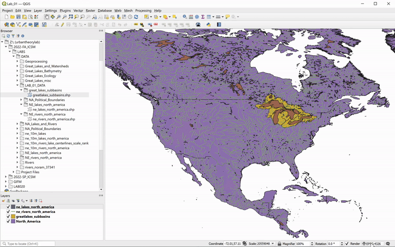
Return to your QGIS project, and add the
greatlakes_subbasins.shp, ne_lakes_north_america.shp and ne_rivers_north_america.shp to your scene (ignore any warnings that may pop up).Rivers are represented by lines, and countries, lakes, and basins layers are represented by polygons. The order of the layers can be controlled with the Layers panel (click and drag to reorder). You can toggle layers on and off by clicking the check-mark next to their name, allowing you to choose which are visible when multiple layers are added to a project. Save your map project.
Note that the colors are the same for all features in a layer, and the assigned color is arbitrary.
Attribute Table and Interactive Selection
Each line, point, or polygon in a feature class corresponds to an entry point in a data table — an Attribute Table. Attribute Table contains information about the features in the shapefile. Attributes can be descriptive, such as the name of a river or lake. They can also be quantitative, such as the length of a river or the surface area of a lake. To access the Attribute Table of a layer (and thus inspect the attributes of each feature), right-click on the layer name in the Layers panel and choose
Open Attribute Table.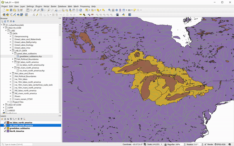
To quickly identify which polygon corresponds to a given feature within the Attribute Table, you can interactively select a feature by clicking on the row number. This will highlight the feature in the attribute table and the data frame.
Of course, the relationship between the geometry and attributes of a feature also works in the opposite direction. Using the Selection Tool from the Selection Toolbar (chosen in the GIF below), you can interactively select polygons and highlight them in the Attribute Table (make sure the layer you want to select features from is highlighted in the Layers Panel). Further, you can isolate selected features in the table: choose
Show Selected Features from the Attribute Table’s filter drop-down menu. Click the Deselect Features button on the Selection Toolbar (or on the
Attribute Table’s Toolbar) to deselect any selected features. 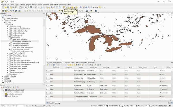
Click the
Pan Map button on the Map Navigation Toolbar to exit the Select
Features tool.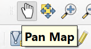
On your own: interactively select and inspect features and attributes of the all added layers.
(A Very Short) Intro to Projections and Coordinate Reference Systems
Map projections are mathematical transformations used to represent a three-dimensional shape of the Earth on a flat surface. Every time we display a geospatial dataset on a computer screen, a map projection is involved. They are powerful, complex, fun, but can also be frustrating to work with.
We will cover projections and coordinate reference systems (CRSs) in future exercises, but for now, just be aware that QGIS automatically sets your project’s CRS to the one specified by the first shapefile you bring into your project (that’s what the .prj file of your shapefile ir for). To find out what CSR you’re in, check the Status Bar (bottom right corner of your window):

There will be a letter and number code, here EPSG:4326. Double-click on it, and the CRS dialogue will pop up; you’ll see any recently used CRSs, a library of predefined CRS options that come with QGIS (over 7,000!), and the specific information about what CRS is in current use:
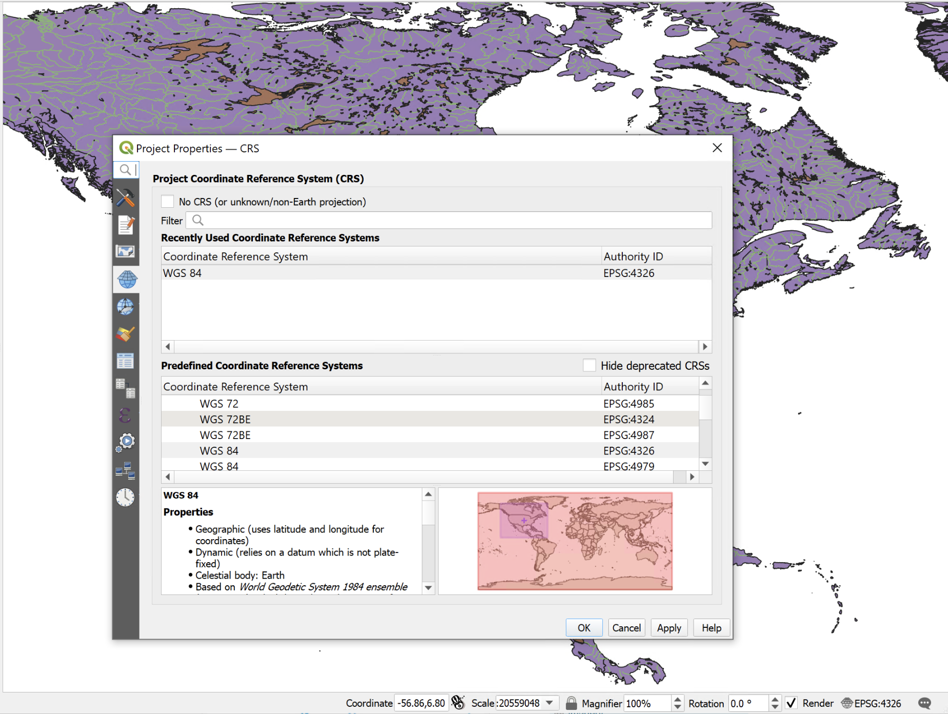
There are many projections for many uses; some are created by governmental agencies for use at a very specific scale (for example, each state has its own CRS that is optimized to minimize distortions for that scale), while others are meant for global use. The one we’re using, WGS84, is the standard CRS for global use, and is specified by the majority of global datasets.
The next step is to change the CRS. While there are quite a few complicated steps going on behind the QGIS curtain, from the user’s point of view it’s a fairly straightforward process. In this example, let’s choose USA Contiguous Albers Equal Area Conic (ESRI: 102003) which, as the name suggests, is centered to the contiguous USA, and is developed to preserve surface area properties of the features in this region:
Intro to Symbology
Now that we’ve set up the desired CRS, it’s time to change the appearance of our layers. To start, we will change the background color from white to blue.
Click through
Project > Properties… and in the General tab, change the Background Color to the desired blue (the data frame’s
background color is serving as the color of the area not covered by any
layers):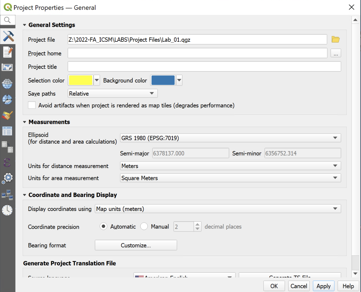
Next, we will set the symbology of the countries layer to appear like a borderless blue continent:
-
Right-click on “North_America” and choose
Properties… - In the Symbology tab (third from the top), choose
Single Symbol(default) - Click on
Simple Fill, set the Fill Color to blue (darker than the background blue), and Stroke color toTransparent Stroke
- Click Apply and OK.
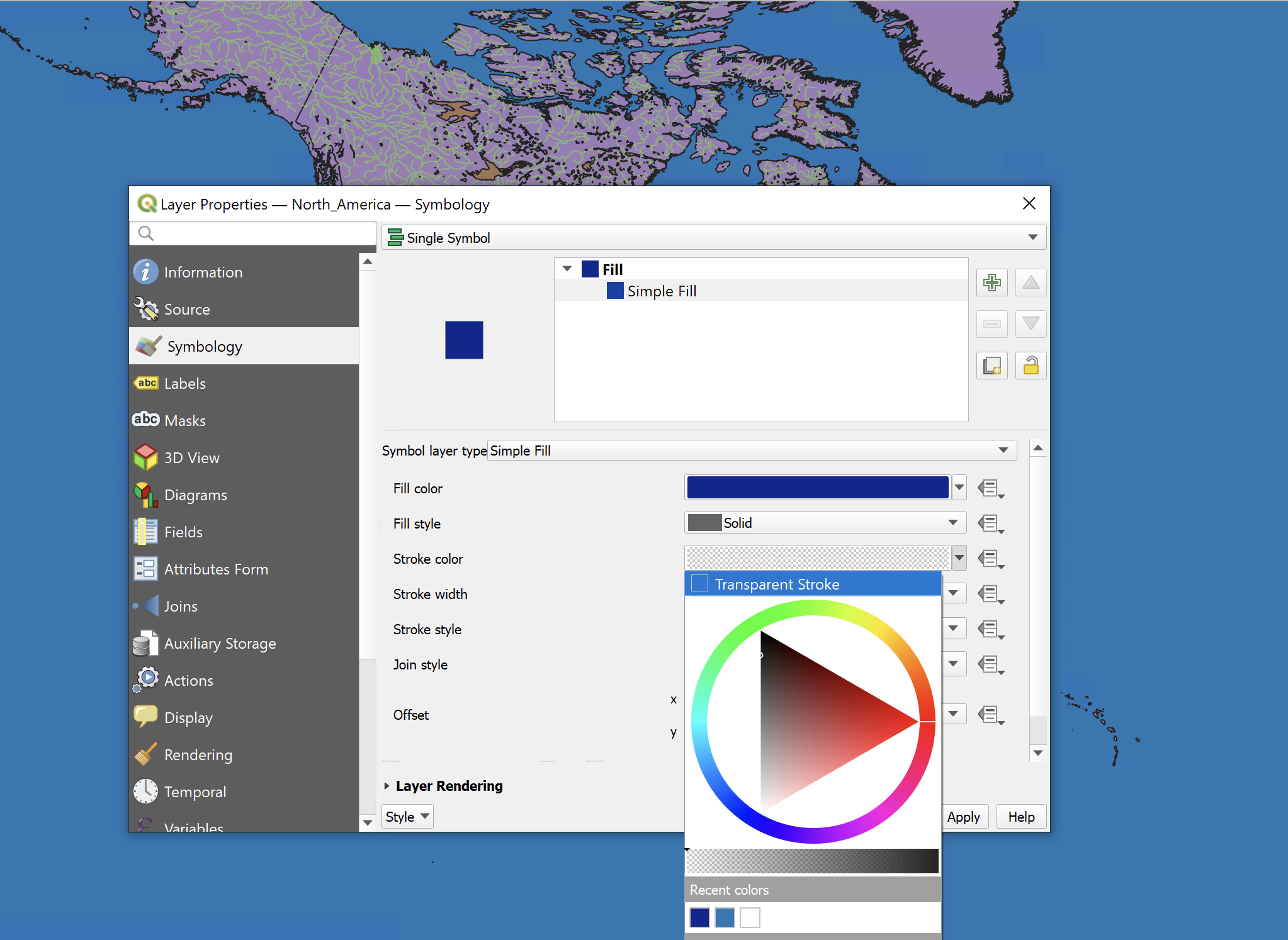
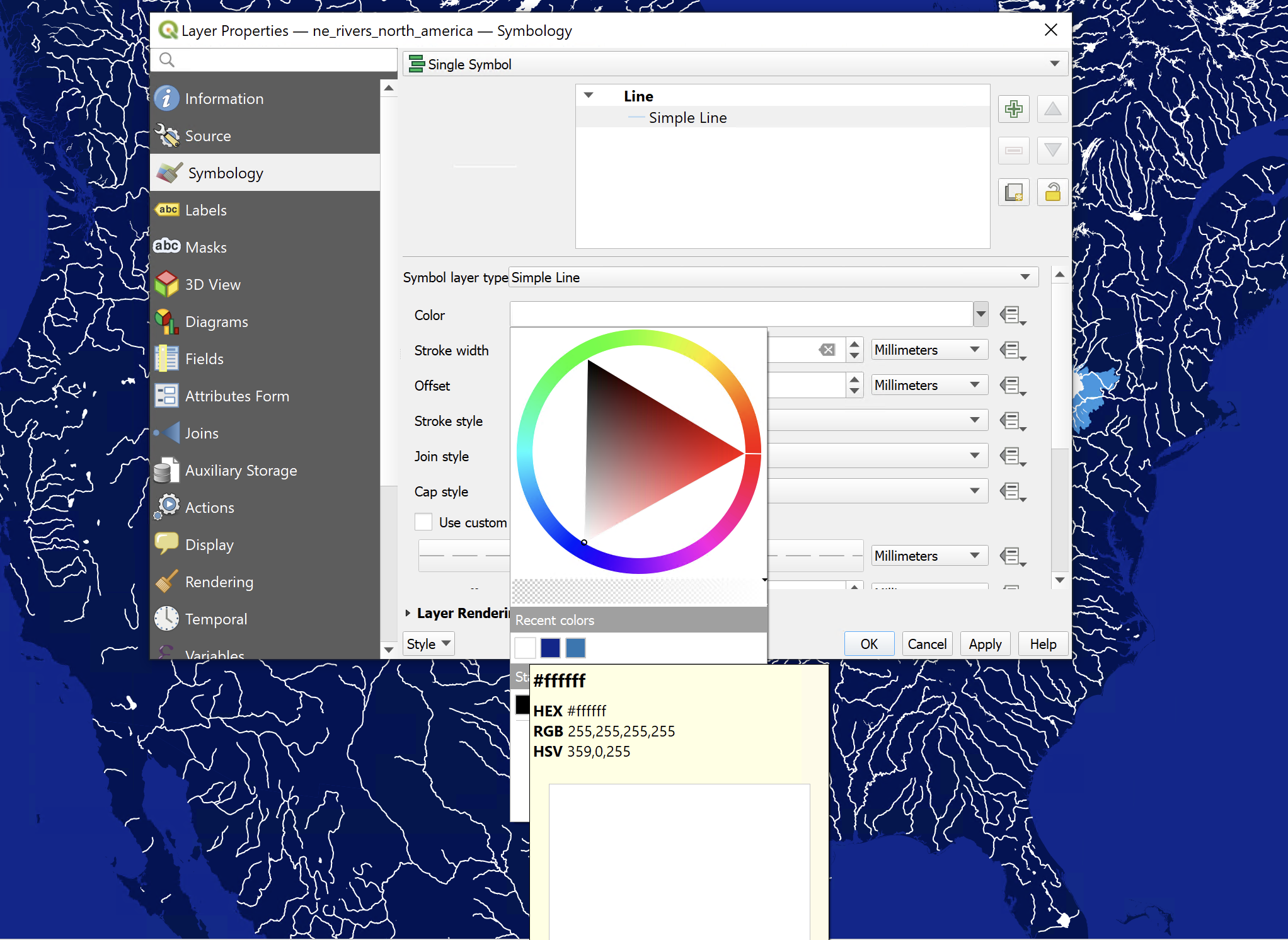
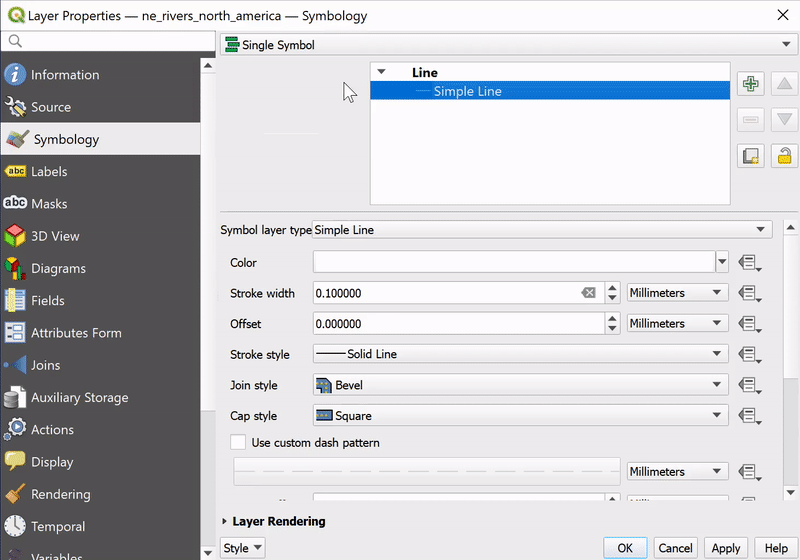
Repeat the process for the subbasins (setting the Fill color to an even lighter blue) and lakes (setting the Fill color to white). Finally, set the river colors to white. For the rivers, represented by lines, set the Simple Line color to white. Click OK .
What if we want to add hierarchy in the way we represent rivers and have the widths of the river centerlines to correspond (in relative terms) to the sizes of their drainage basins? Luckily we have a field in the shapefile’s Attribute Table – strokeweig – precisely for that purpose. Open the Attribute Table of the rivers layer again and notice that the strokeweig values range from 0.2 to 2. Next, open the layer’s symbology tab again (by double-clicking on the layer name in the Layers Panel) and follow these steps:
- Change the Symbology from Single Symbol to Graduated
- Set the Value to strokeweig
- Set the Method to Size
- Set the size range from 0.1 to 2
- Change Mode to Natural Breaks (Jenks)
- Set the number of classes to 5 and click Classify
- Click OK and close the Layer Properties dialogue box
Voilà! Save your map project.
On your own: What happens if we change the Value from
strokeweig to scalerank? Experiment with colors and other symbology settings of your layers. QGIS Print Layout end Exporting
You’ve just completed the first (and most extensive) part of this workflow sequence. The following part covers the basics of creating a print layout in QGIS and some considerations for cartographic design in general. The covered technical material allows you to move your QGIS projects from map space to paper space and export your work either in a print format or in a form that will enable you to continue design work in another software environment.
So far, you have worked within QGIS’s Map View, adding and symbolizing geospatial datasets. This environment lets you view your data from whatever spatial scale you set through the zoom and pan settings in the map canvas view. We can refer to this environment as data space. To export your work from QGIS to be viewed as a static image outside of the program, you must fix the spatial scale and extent of your map. This can be understood as paper space. The
Print Layout function within QGIS is a tool that enables this transition.The transition from data space to paper space also opens up the opportunity to think about aspects of cartographic design that are not relevant when performing analysis in QGIS, but are relevant for informing and orienting your audience to the geographic context of your map.
How will you convey the meaning(s) of the chosen symbols?
Maps typically have:
- a legend that explains the symbols and colors used on the map
- an indication of scale (either a scale bar or, in the case of printed maps, a ratio scale or written scale, 1"=1000' for example)
- a note showing the projection used
- a north arrow
- citations for all data sources
- the name of the cartographer and/or publisher
- (sometimes) a grid or a graticule to convey the coordinate reference system
You can add those map features in the When you are satisfied with your symbology choices and are ready to export a map document from QGIS, you will need to create a new Print Layout.
Select the
New Print Layout tool in the main toolbar or click through Project>New Print Layout from the top menu. You will be prompted to specify a name for your new
layout. Each QGIS project can have multiple associated print layouts, so
choose a descriptive name for the layout you are hoping to create so
that you can distinguish it if you ever add an additional layout view.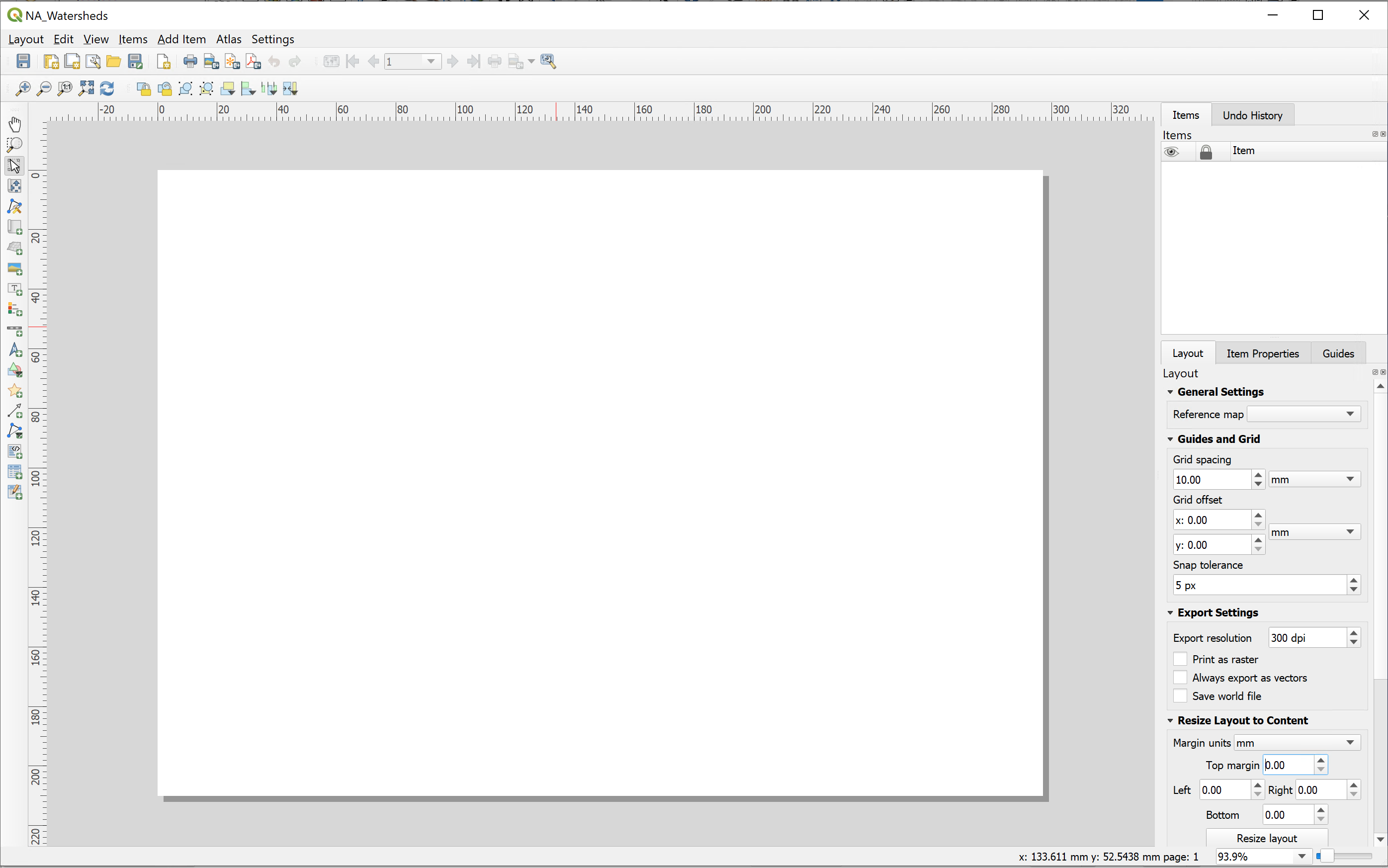
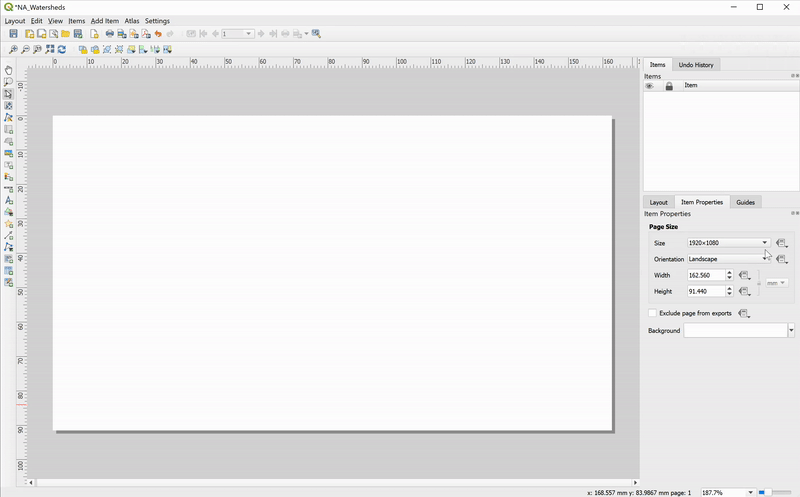
To set up page dimensions and add a map item, follow these steps:
-
Right-click anywhere on the blank page and choose
Page Properties…(theItem Propertiesmenu will appear on the right) - Specify the dimensions of the page:
1080 x 1080 px
On the left toolbox, click
Add Map and then click and drag on the paper a rectangle over the area on your page that you want the map to cover: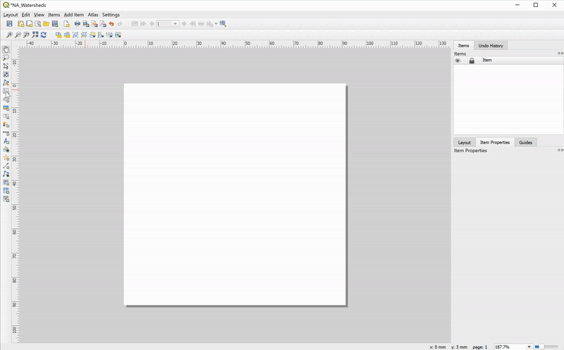
- Click
Move Item Contentto pan to the desired area (this allows you to navigate through data space within the Print Layout tool) - Set the desired scale in the Item Properties tab
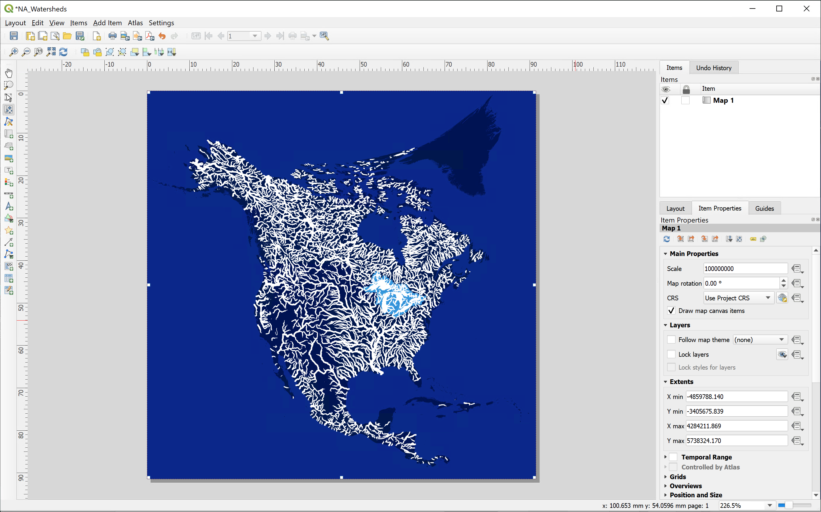
At this point you may want to go back to the data view to adjust your layers’ symbology settings to better fit this particular layout size and scale (for example, I changed my rivers centerlines widths by setting the new size range from 0.1 to 1).
If you close the Layout window, or want to work on a different layout, you can do so by clicking on the Layout manager in the main toolbar and the list of your project’s saved layouts will pop up:
We will explore more Layout tool functionalities in the coming weeks, but for now, let’s wrap up this section by exporting our map. Save your project.
You can export your layout as an Image, SVG, or PDF by either clicking through
Layout > Export as… in the main menu or by clicking their corresponding buttons on the Layout Toolbar: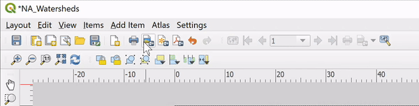
Notes on Workflow
It’s possible to use the Print Layout tool within QGIS to design complete and visually compelling maps. However, it is generally much faster to use the Print Layout as a part of the larger workflow to:
- Define a map/paper/artboard size
- Set the spatial scale/extent of your map(s)
- Add any orienting map elements (scale, legend)
- Export to continue your work in a dedicated graphics editing software
Exporting maps with vector-based data in SVG format allows you to manipulate your data layers' style, symbology, or overall composition in Adobe Illustrator or another vector graphics software.
Choose
Export as SVG… and ensure you have the following options checked:
Export the SVG file in your working directory and save your project. Close QGIS.
Important: Continue using best practices for file organization, management, and naming conventions; consider exporting all QGIS files into a subfolder, e.g
L01_qgis-exportsOpening Illustrator
Launch Illustrator. You will be prompted to choose a template for your project: several options exist for different kinds of print and digital work (similar to QGIS layout presets). We can customize options here, including the standard size, orientation (portrait or landscape), and the number of “artboards” — you can think of an artboard as an analog to a canvas or drawing surface. You can also give the file a name in the “More Presets” dialogue. Once you click Create, AI will create your new project document. You may also skip the “More Presets” step and create a document directly from the previous dialogue.
Begin to familiarize yourself with the interface. It should look something like this:
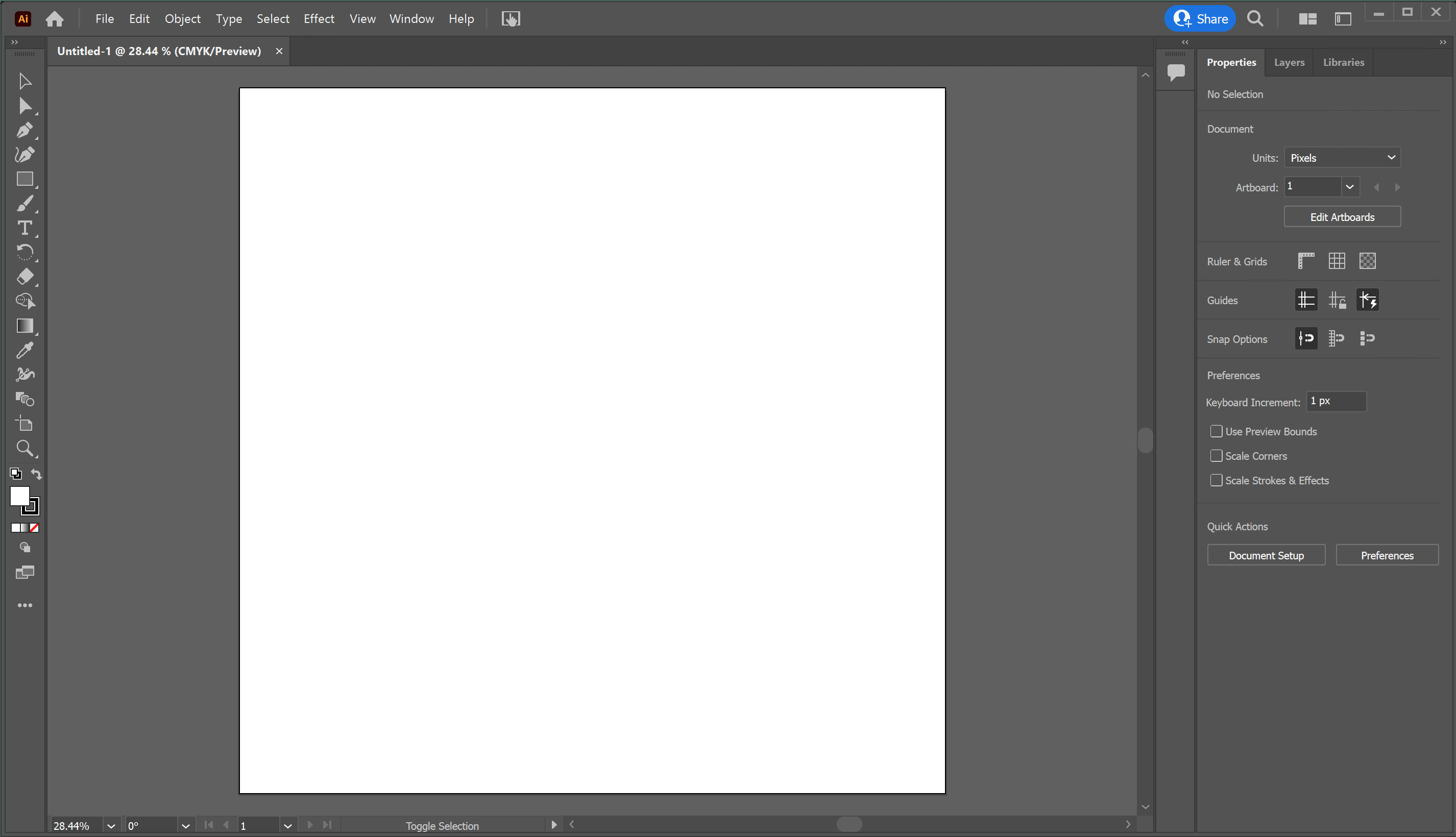
Depending on which “workspace” you’ve selected (
Window > Workspace) you’ll see different tools (left) and panels (right). The default option is called Essentials. Like in QGIS, the toolbars and panels are movable, allowing you to set up
your preferred workspace. You can always add or remove these workspace
elements by clicking Window
and selecting the different panels you’d like to display or use, or you can “undock” and drag them around.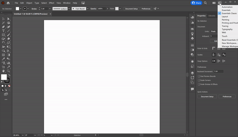
Adding Artwork
Next, open your SVG file by dragging it from Finder/File Explorer to your workspace. Note that this will open a new document in a separate tab. You can actually skip the process of creating a new document if you aim to edit an existing Ai-editable file (such as an SVG we just exported from QGIS):
Open your Layers Panel (to the right), and note that the data layers from QGIS (including the background) are all preserved as separate sublayers of the “Layer 1”:

Just like in QGIS, you can control the order of the layers in the Layers panel (click and drag to reorder), and you can toggle layers on and off by clicking the little eye icon next to their name. You can also “lock” individual layers by clicking the little padlock sign next to their name, which will prevent you from accidentally moving or deleting any layer features.
Now, toggle all layers off except the background and the “North_America”:
If your artboard looks like the image above, you must be thinking: “Oops! This doesn’t look like North America. What now?”
Let’s assume you’ve gone back to QGIS, and re-exported the SVG (and triple-checked the settings were correct), but the problem persists... Unfortunately, this is widespread in these types of workflows: one of our layers got broken down in the process, and we cannot correctly display it in Illustrator. (Your geometry will break down more often if you’re changing coordinate systems in QGIS, which we did).
Luckily, there are many ways we can troubleshoot this issue. We will offer three approaches below, and we are agnostic as to which one you choose to pursue (although we recommend exploring all three on your own!).
Option 1
You’ve realized that you don’t need to include features representing the continent for your map to convey what you want. This is legitimate and often the best solution when the layer in question is there only to provide a background/context to your map (it wouldn’t work for the rivers layer, obviously).
In this case, all you need to do is toggle off or delete the layer, and you can export a finished map (or continue editing other features that are displayed correctly, of course).
Option 2
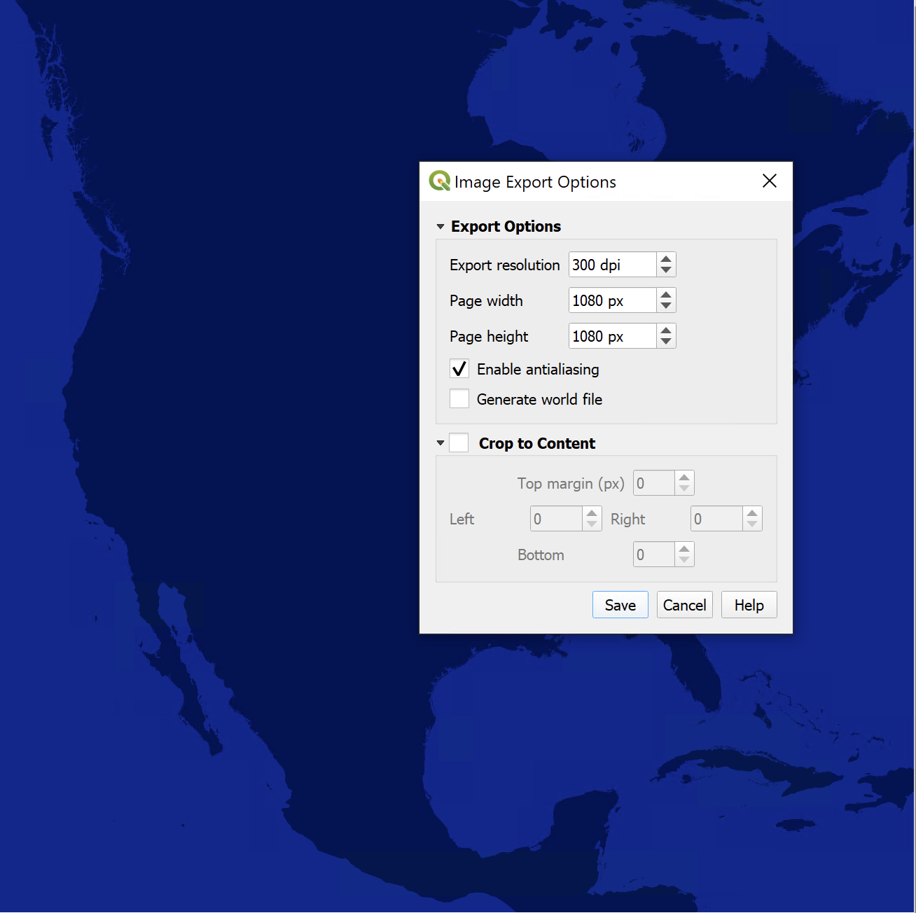
You’ve figured out a “hack” by separately exporting only the “corrupt” layer from QGIS, but this time as an image (raster file) instead of an SVG (vector file). You will then import this image into your Illustrator file and replace the faulty linework. To do so, follow these steps:
- In QGIS, toggle off all layers except countries (North_America)
- Open the Layout tool and proceed with the export; choose
Export as imageand select PNG format
- In Illustrator, delete all objects in the “North_America” layer
- In the Illustrator’s menu bar, click through
File>Place...and select the PNG image you just exported - Click on the top left corner of the artboard; the image should populate the entire artboard
- A “<Linked file>” will appear as an object in the Layer 1
- Drag it to the (now empty) North_America layer and lock the layer
Toggle the visibility of the basins, rivers, and lakes, and you should be done!
Option 3 (most elegant)
You’ve decided to look for another (polygon) shapefile representing countries or continents that won’t cause you any trouble during export. You got lucky: Natural Earth has a dataset called Land (Land polygons including major islands), which does precisely that!
In this scenario, all you need to do is download the “Land” dataset and use it in this exercise instead of North America (you may notice that the “Land” is a global dataset, but that shouldn’t be a problem for completing the work; just zoom into North America and ignore the other polygons).

Exporting Artwork from Illustrator
When you’re done troubleshooting and editing linework, it’s time to export your drawing.
To export a vector file format such as an SVG or PDF (which can be significantly resized without losing any of their quality), navigate to
File > Save a Copy... and choose the desired file format.To export a pixel-based raster file like PNG or JPG, navigate to
File > Export... and choose the desired format.If you want to export an image cropped to the exact dimensions of your artboard (as opposed to cropped to your artwork), select
Use Artboards in the Export dialog box.